The Design of IKEA
Why do I always enjoy a stroll through IKEA? Am I old and affordable-furniture-obsessed?
Is there anyone who didn’t own one of these coffee tables in one of 3 colors at some point in their lives?
Maybe. But it’s also well-designed. In addition to the maze-like structure that forces customers to walk through and view nearly all of its roughly 12,000 products, here are some more design decisions I noticed:
Now furniture-shopping can almost double as date night.
1. A free children’s play area. IKEA recognizes that a good chunk of their target audience may have children. I can’t comment on the experience within Småland and what liability issues might arise on the business side, but…seriously, what a good idea to let Mom and Dad get lost in the furniture mazes for a bit without having to keep watch over Junior. Good for customers, and good for the bottom line.
2. Showrooms, and of all kinds. Who knew there was a way to make a 550-square foot studio look decent? It may be that 60% of store items won’t fit in my apartment, but I appreciate that IKEA shows examples of small places, too. Showrooms in general allow me to visualize what different items would look like together in a shared space, and I wish more furniture stores did it.
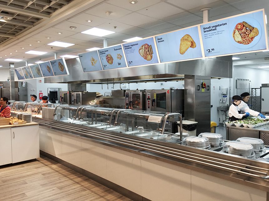
3. A strategically-placed food stop. At least at the Emeryville location, the cafeteria is somewhere in the middle of the maze customers walk through. IKEA stores in general are around 300,000 square feet, so access to non-overpriced food without having to leave is a great decision. The cafeteria is also clean and spacious, good for making customers not feel like they’ve been trapped into eating somewhere non-ideal just for convenience’s sake.
For when you need help remembering just how small your apartment is.
You already know the meatballs are part of your reason for coming here.
4. A procurement area at the conclusion. Just imagine having to lug a giant box of disassembled bookshelf parts through the entire store…though the pen and paper system of storing product numbers is a bit archaic, I like the system they have for self-servicing furniture at the end of the experience.
Save the transport of back-breakingly-heavy furniture for the very end.
The only part of the furniture shopping experience IKEA didn’t really improve on is the checkout system, where it feels a bit clunky though it’s just the traditional method of going through a cashier. I’d like to see them revamp this part of the experience — maybe allow customers to purchase and checkout online and instead place receipt-checkers at the exit, Costco-style? It could speed up the process and would also render the pen-and-paper recording of product numbers obsolete.
Overall, though? I’d say IKEA’s design is fantastiskt.


