🎉 Woo-hoo! The product is LIVE on the Fekkai website as of March 2020: check it out here! 🎉
Fekkai
UX/UI Design | Competitive analysis | Usability testing | QA
Overview
Company
Fekkai is a haircare/salon brand that was founded in 1996 as the namesake of celebrity hairstylist Frédéric Fekkai. It enjoyed a cult following as one of the first mass-available luxury hair brands in the 2000s. Since the mid-to-late 2010s, the brand has sought to update and modernize their profile, subsequently relaunching products with clean ingredients and sustainable packaging.
Role
I was the UX/UI designer for a small department within Fekkai focused on company innovations, supporting a team with a product lead, product manager, and developers.
Scope
This was an approximately 7-month long contract. The near-term, primary goal was to deliver a modern, informative haircare quiz that gave results for made-to-order shampoo and conditioner for the individual quiz-taker. I was also involved in discussions of future goalposts and what needed to be accomplished in order to future-proof our designs.
Approach
1. Competitor research
2. Prototype
3. Usability tests
4. Re-design with feedback
5. Repeat, with QA
Specs for the Product
There were a few things we knew we wanted to include in the final quiz:
A cohesive design for different question types (multiple choice with and without descriptive images, user input fields, and sliders)
A section allowing users to open their device camera and take a selfie for machine learning hair diagnosis
2 major “payoff” screens: one for after users input their zip code, and another at the end of the quiz that offers insight into the user’s hair and the actual recommendation
Mobile-first, but responsive on desktop and tablet (iPad, specifically)
Design an internal tool that intakes all customer responses
Competitor Research
Screenshots of various parts of the hair quizzes from Prose, Function of Beauty, and Formulate.
The product team and I looked at comparable hair companies who also feature a quiz and personalized hair products — this helped inform me when it came to getting a basic understanding of what information users might expect to be contained in our .”payoff” screen, and what kind of copy would best clarify the customization/shipping process for the customer. In the early stages, studying their design also helped me fill in the blanks for content (wherever it wasn’t yet available from our internal marketing team), and get a general sense of iconography used (“What does an icon for “oily scalp” look like?).
In addition, studying the competitors allowed me to be able to see how the quiz designs changed when viewed on mobile vs. desktop.
V1 Prototype
Here are some select screens from our first prototype:
Landing page where the user will launch the quiz
Slider function with image “window” in action. In the final, we wanted the lines in the image to curl and straighten seamlessly instead of popping from one image to the next.
Part of the final payoff screen
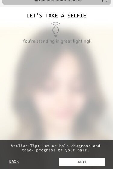
Pre-selfie screen design. This screen detects and confirms if there is sufficient light for a photo that gives high enough confidence for our machine learning detection to work
The design of the actual selfie screen
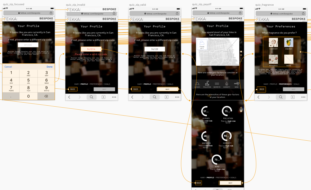
Showing the flow between some of the quiz screens
User and Usability Testing
We conducted and recorded usability testing sessions to gather feedback on the content and usability of our first prototype. These helped us gain some clarity into the following questions, amongst others:
Do the quiz questions feel relevant? Is it clear what they’re asking?
Do the given answer choices cover the user’s options, or do they wish they can answer differently?
Does the length of the quiz feel worthwhile for the results?
How does the selfie portion make users feel?
We looked at the results and organized them into general pain points, then prioritized them to figure out which I should synthesize into my next redesign.
V2 Prototype
After some discussion with stakeholders, we decided to try refactoring our quiz into a chatbot format to evoke a more modern and organic feeling — a conversation instead of a quiz. We wanted the user to feel what it’s like to sit in the chair at one of Frédéric Fekkai’s salons with the celebrity hairstylist himself asking you questions about your hair routine and figuring out what’s best for you. We hoped that by being more conversational this would also slightly lessen the hesitation some users felt in the selfie-taking portion of the quiz.
Sample screens from the first chatbot-style design iteration, with prototyping flow.
Sample screens showing the redesign of regular quiz format to chat format.
In addition, we had to determine the logic for how the machine-learning component of our “selfie” portion would work — including what would happen if it fails (not enough confidence in results) and how to handle incorrect detections even when confidence is high. We also had to tweak the percentage of confidence a few times before we could figure out what number was considered high enough.
Flow showing the branching logic from the AI’s high/low confidence of hair type detection
Further rounds of usability testing, much QA, some visual tweaks, and many iterations later, we went live late in March 2020. The initial two weeks of launch saw a quiz completion rate of over 65% out of hundreds of quizzes taken! We were excited to see if getting exposure and conversions even before the marketing team initiated any advertising campaigns!
Takeaways
Despite some changes in the goalposts during the project due to budget and logistical constraints, I’m happy that our team worked closely together through the pivots and pulled through to release on time. Maintaining thorough and efficient communication lines among our team helped keep us, from the project manager to the developer to me as the designer, on the same page at all times.
One challenge in our team structure was that we had no official scrum master, so occasionally, in the heat of urgency, tasks would get added to our sprints without due process. For future projects, I would take better care in maintaining the integrity of our scrum board and assign dev time to all tasks, asking for help from the other team members when I need it. It’s to the benefit of the whole team to deliver the product in a timely fashion without burning out the members!


