Sofa Social (formerly Sofa VR)
UX/UI Design | Competitive analysis | User/Usability testing | Deployment
Overview
Company
Sofa Social is a startup answering the question of "How do we create a better experience for spectators of the VR experience?" In order to bridge the gap in adoption of VR hardware, Sofa Social sought to create a mobile-centric experience that gives a wider group of people a taste of VR without the pricey investment in a headset and VR-compatible machine.
Role
I'm the first product designer at the company, responsible for a variety of product-related tasks such as testing (both user and QA), designing for both mobile and physical spaces and communicating decisions to the development team, creating marketing materials, and troubleshooting for the company's first clients.
Scope
This is a long-term project at an early-stage startup, so scope ranges from research/testing to marketing to live deployment. There has been one major pivot in the product to date, a move that took Sofa Social from being a VR-based company to an AR-based company.
Approach
1. Prototype
2. Test
3. Prioritize & assimilate feedback
4. Repeat until PMF
Prototype (v1)
Brief explainer of our product (v1) that I recorded and edited.
The first vision of the product was a downloadable app that allowed users to:
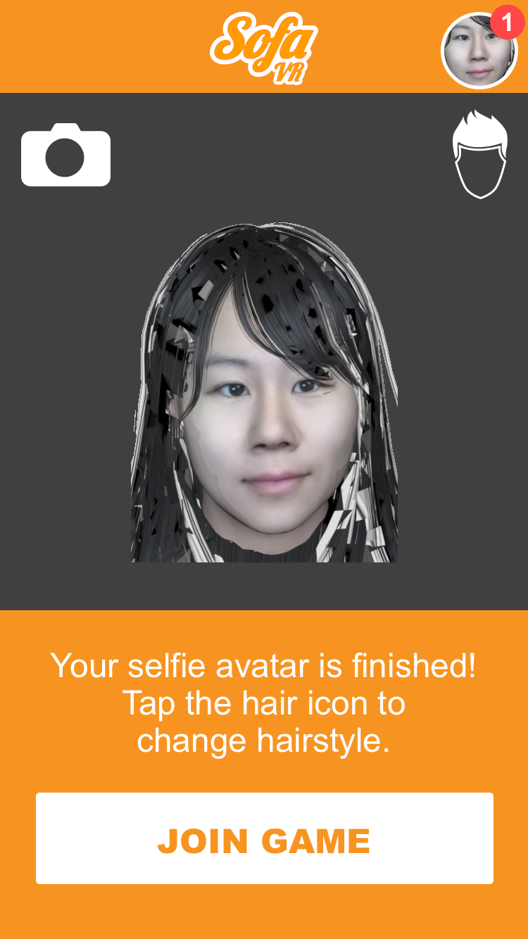
1. automatically create an avatar of themselves that could populate in the VR world (even if the user is not wearing a VR headset), using just a selfie picture.
2. join in a VR player's game by entering a code displayed on the VR player's monitor.
3. play versus the VR player, using their smartphone as a joystick controller, or...
4. record video of the VR player within the game environment.
To accomplish all this, a number of robust designs were required due to the complexity of the product, including:
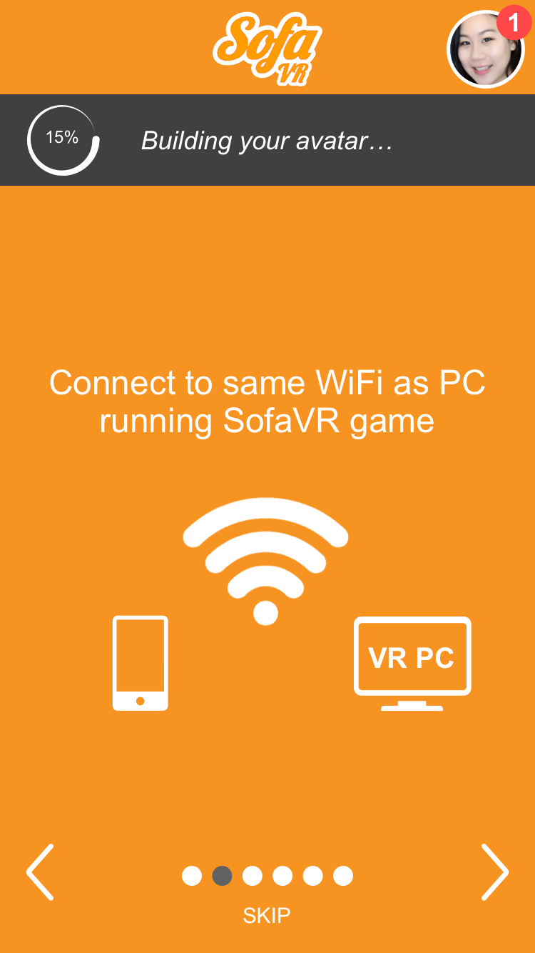
1. Onboarding/tutorial screens, to help users understand the purpose of the app and all its features.
2. Account creation/login, to allow users to easily re-access their avatar and personal items.
3. Game controller design, to make the experience of using a smartphone as a joystick device as pleasant as possible, without the advantage of tactile buttons/haptics.
4. Interface design, to prioritize what will be the most-used features onto the main page and understand where access to secondary features should be available.
Sample mockup screens of app onboarding/tutorial.
Mobile-game controller design.
We tested concurrently as we designed and built the first working prototype.
What we learned:
Testing and market validation brought us to the conclusion that the product was too "early" for game developers and users alike.
1) It required too much effort on indie VR game developers' part to incorporate an asymmetric aspect into their game while making sure that playing was fun and balanced for both the VR player and the "couch" player.
2) There was too much friction involved in getting users to download an app for a (typically) one-time visit to a VR arcade. Most VR arcade customers are newcomers, and downloading/learning to use a fairly involved app was a large ask.
Our solution/the pivot:
In order to alleviate the two major issues, the team came to a consensus on a few major changes:
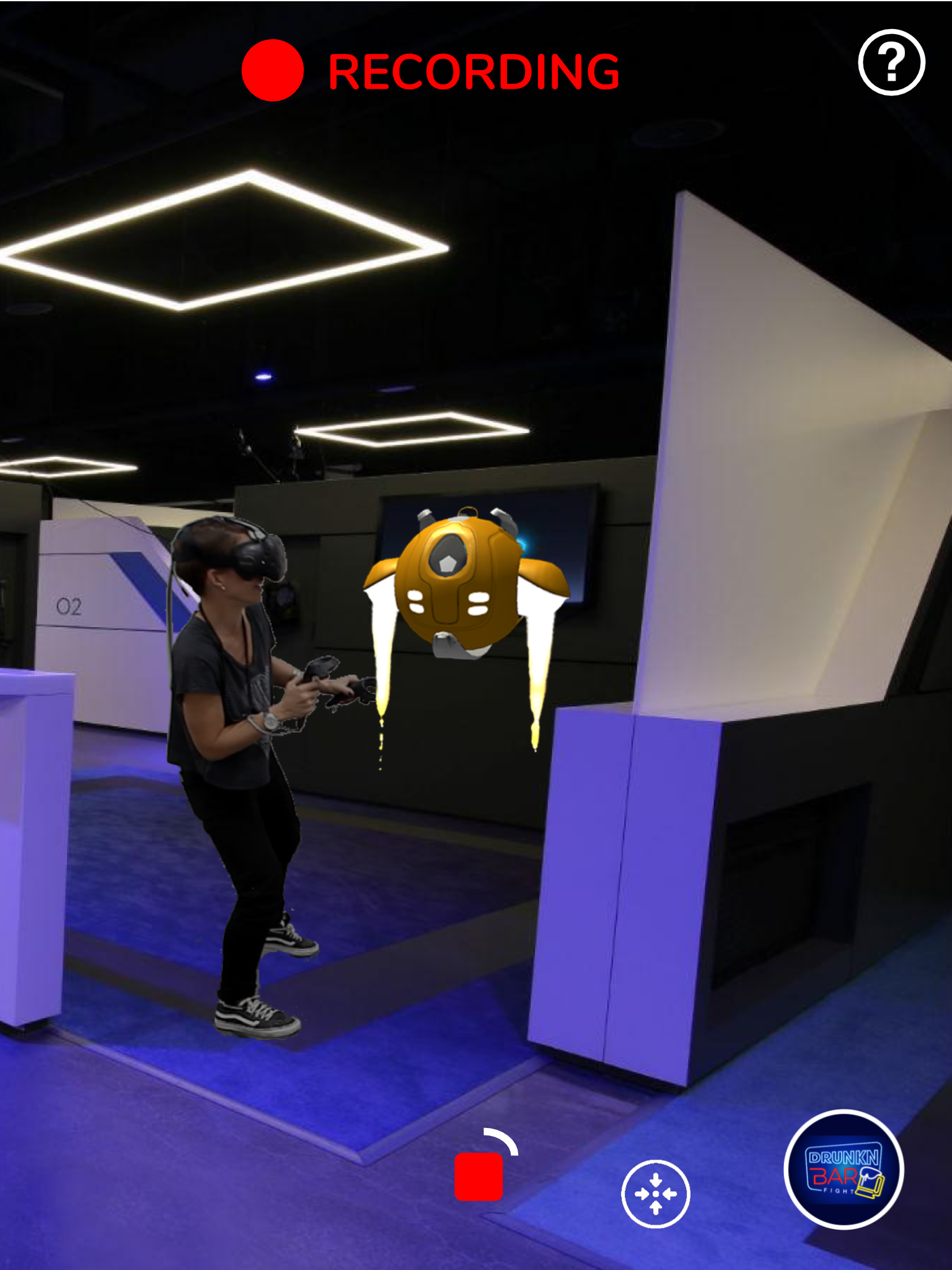
1) Use AR to enable spectators to record video of the VR player, but with game context. We noticed that most people instinctively record their friend anyway, but the end result is the friend miming in empty space. AR elements could immediately enliven UGC, and it was a win-win for everyone: better video shares for the customer, marketing material for the VR arcade, and an easy, lightweight drag-and-drop incorporation for VR game developers.
2) Reformulate the product into an in-store kiosk. Our app would come pre-downloaded onto an AR-kit-compatible iPad that sits at the front-of-house or beside the spectator couches that are usually present at VR arcades. This would remove the friction of an app download and incentivize customers to try at a much lower risk (no personal information given, no data used, etc.).
3) An additional idea we had was inspired by the trope of the omnipresent scream-cam on roller-coaster rides. We could display the videos that customers take and create a living stream of AR/VR UGC -- we termed this the "sharewall."
Prototype (v2) + Competitive Analysis
Elements that had to be designed and built for the product pivot:
1) A new user flow that wasn't user-specific and didn't require a log in.
2) A way for people to take home or share the AR videos they create.
3) AR screen interface, including how an object can be manipulated in AR (resizing, rotating, moving, etc.)
4) Kiosk-centric design vs. app-centric design (kiosk needs to time out, personal information needs to be cleared, etc.).
5) Movement behavior of the "sharewall." How does it display/scroll through a queue of videos? How does it incorporate new videos?
Explainer of our product (v2).
Sample AR iPad kiosk screens.
Sharewall in action in lobby of VR arcade.
View the Sofa Social sharewall here. Our kiosks are currently also live at IMAX VR (in Los Angeles). View the IMAX-branded sharewall here.
Update (2018): This is a live page, as the product is always growing and developing in exciting ways! Stay tuned for changes.
Update (2019): Sad news — Sofa Social has shut down as of 2019. Our tight-knit team continues to keep in touch with one another, and our work is preserved on our Facebook page (there are likely also a few artifacts of the company floating around at certain VR arcades)!


