
Pilotly
Usability testing | UX/Competitive research | Prototype
Overview
Company
Pilotly is a web platform that allows for media survey creation. Typical users are media and entertainment companies who want a way to easily gather feedback from a large, remote audience through various types of survey questions.
Role
I was part of a team of 3, and responsible for ideation of "mapping" as a way for users to better visualize the survey. Together, the team split work on all other phases of the design process.
Scope
Conduct usability testing on the current web flow, and research competitors to design a unique video survey-creation process.
Approach
1. Competitive research
2. User testing
3. Brainstorm redesign ideas
4. Prototype
USER TESTING
The first step was to take a close look at the current state of the product and tease out what does and does not work.

Using Lookback to record usability testing sessions.
We tasked 7 different people (each with varying degrees of familiarity with survey creation tools) to create a short, sample survey with test questions. The exercise quickly shed light on problematic areas, as indicated by some quotations from our test users:
"You usually work from the left to right, so I was confused at first."
"I'm unclear about where I am in the process even if I'm progressing through the task."
"I don't know what 'hint time' means..."
"I'm not sure what the path should be for the rest of the questions."
These initial test results indicated issues with confusing flow -- users often felt lost as to where they were in the lengthy survey-creation process -- and ambiguous copy -- granted some of the unintuitive industry jargon was lost on our volunteer users, but other product-specific terms were confusing all around even when we questioned actual users of the platform.
Competitive Research


After compiling and organizing the list of user pain points, I went on to conduct competitive research to see how leading survey-creation web tools managed these issues. I looked at Google Forms, Survey Monkey, and Typeform (among others) to see how they handled onboarding, navigation, and logic paths. Though I drew inspiration from these competitors, the final design for Pilotly included original visuals as well as a distinctive survey-pathing interface — Pilotly is a unique product in the sense that it inserts surveys into video media -- which is not the case with any of the competitors -- and so it required an entirely unique solution.
Prototype


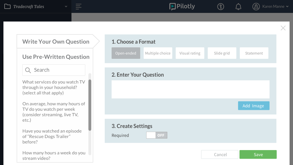
To address the issue of ambiguous/confusing copy, we presented the question format types in a visual manner (much like Google Forms) and also had commonly-used sample questions of that type in the sidebar of a question-creation modal for more clarity and convenience.
To help the user understand where they are in the flow at any given time, we designed a collapsible list of current survey questions that updates as the user created new questions.

Finally, we added one more new feature (a survey "map") that allowed users to see an overview of all of his/her created questions and how the pathing logic linked one to another. This represented a static view of the survey and was complemented by the actual live preview of the video survey.
Our design was validated by another round of usability testing -- comments from the users showed the difference!
"I like the layout. I think it...looks easier than Google Forms [because] in Google Forms, you keep having to scroll down."
"I've never had to create a survey, but this was really clear."
One user who had previously tested the original platform was able to easily perform given tasks and mentioned that it was much easier this time around.
Overall, 5/5 users easily completed the same test/tasks as before!